Set up as part of the University of the Arts London, this website was a network for the exploration of race and diversity in the arts. David developed the identity and the full website for the project.
Shades of Noir

Logo and Branding
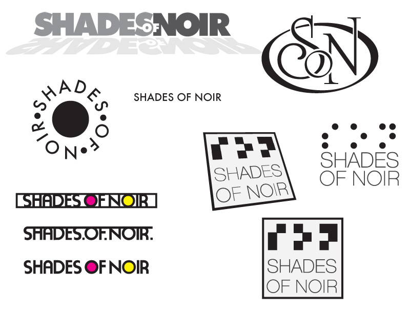
The design was developed by David Pugh and uses the braille for the initials of S. O. N. (Shades of Noir) The concept of braille was to relate to the attitude people should have towards race, gender and any form of discrimination, if you are blind then you simply cannot judge someone on their outward appearance.
branding development designs, work in progress leading to the final design.

Web Design
The Website was also created by David and his team, a clean and simple black and white approach was proposed and developed.