Recharge Hospitality came to us with just a name, and some initial ideas into what they wanted their brand to be. It was a new company specialising in recruitment in the hospitality sector, with a strong emphasis on sales. The name came from the client ‘Recharge’ and this inspired the design team to think of themes and ideas that could explore visual directions for this, but still made it relevant to the hotel sector.
Recharge Hospitality
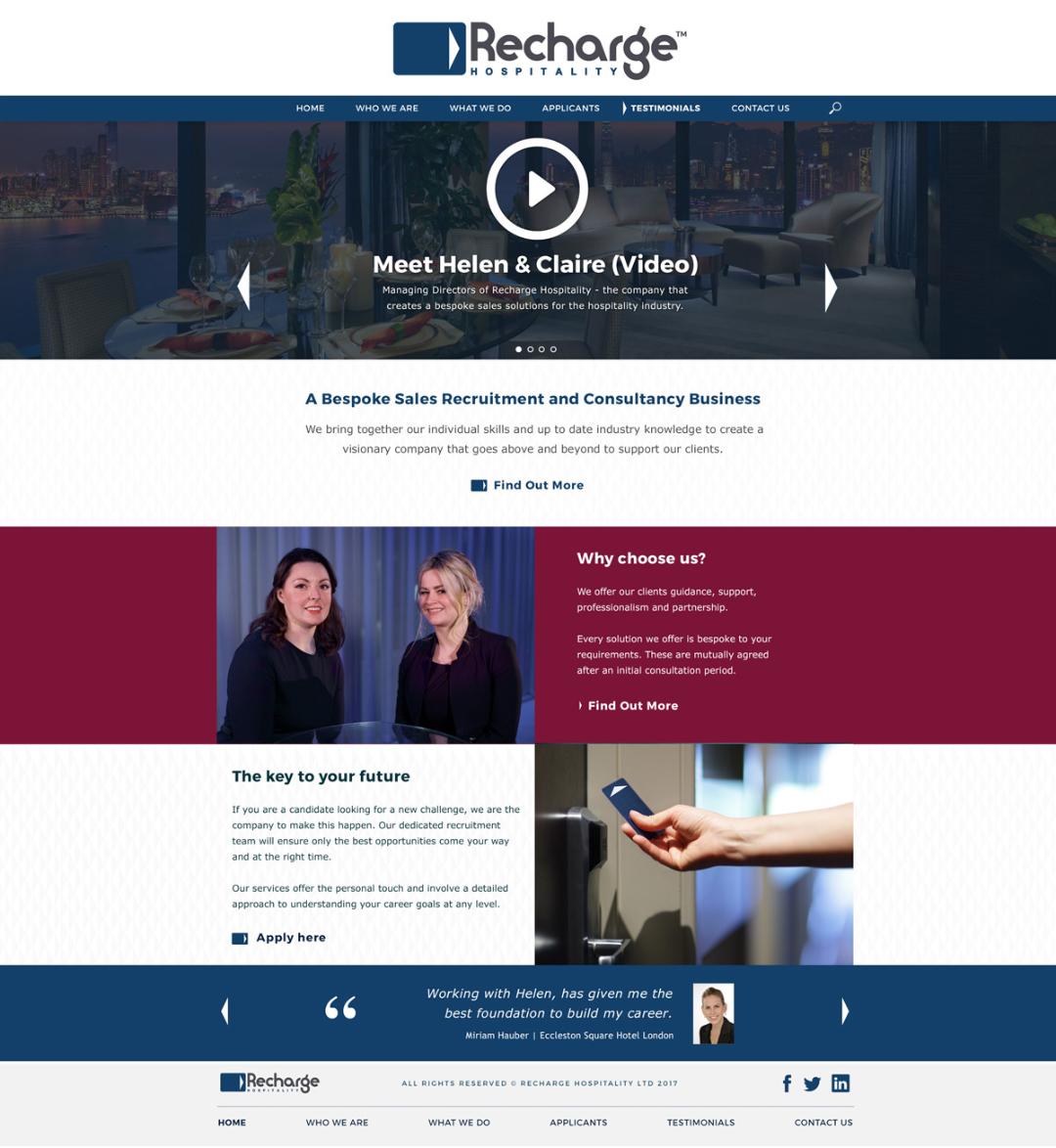
After many concepts, brainstorms and discussions on the idea the concept of the key card was born. An iconic object used in many hotel chains, the directional arrow being the focal point for this. A concept was born for the brand that would show a direction, a trajectory for a new career, as well as the additional symbolism of ‘having the key’ and ‘unlocking the future’.

Web Design
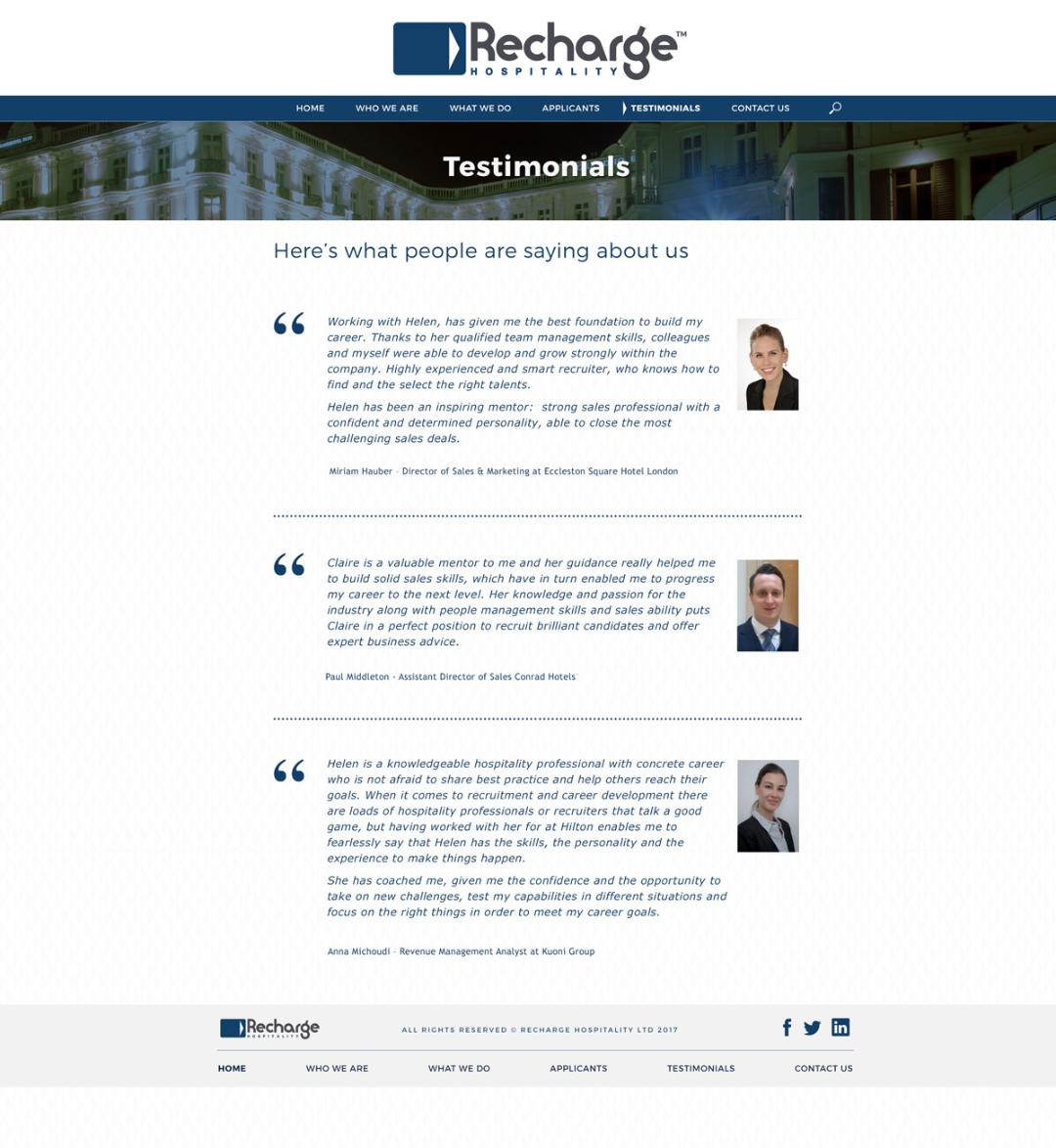
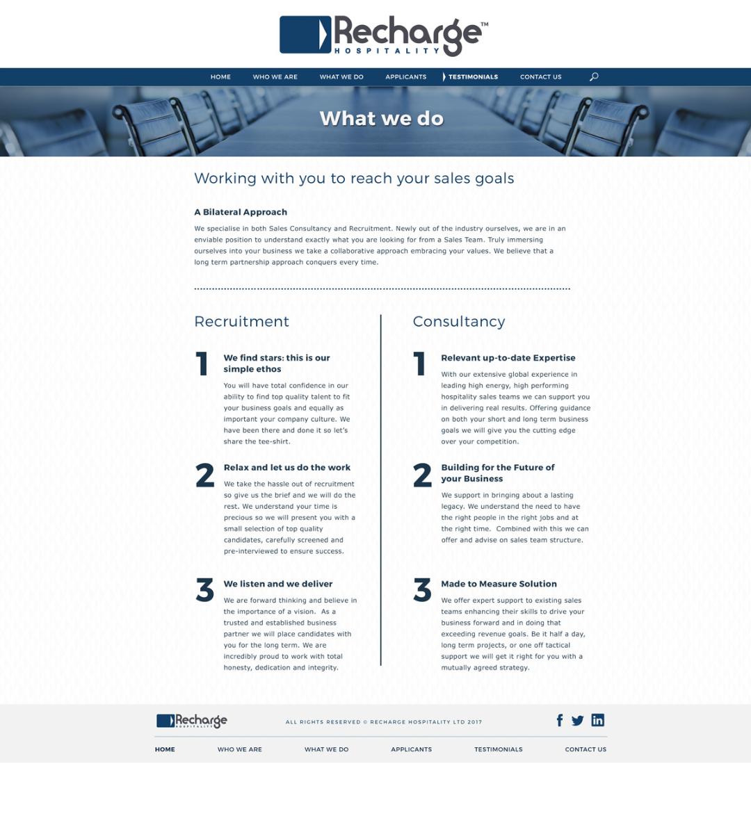
For the web design, the Freelance Graphic Designer team put together a design based around the core themes of the brand and the multitude of benefits that they offer to their clients and prospects. Each slider from the home page promotes a new area of the business, the first being a video which allows candidates and clients to meet the two founders of the company ‘face to face’. This video takes you into their world and allows the viewer to see the passion and personalities of the top management. Far from being a faceless corporation, the focus was to promote a personal touch and human interaction. Encouraging approaches, phone calls and meetings to grow the business.


